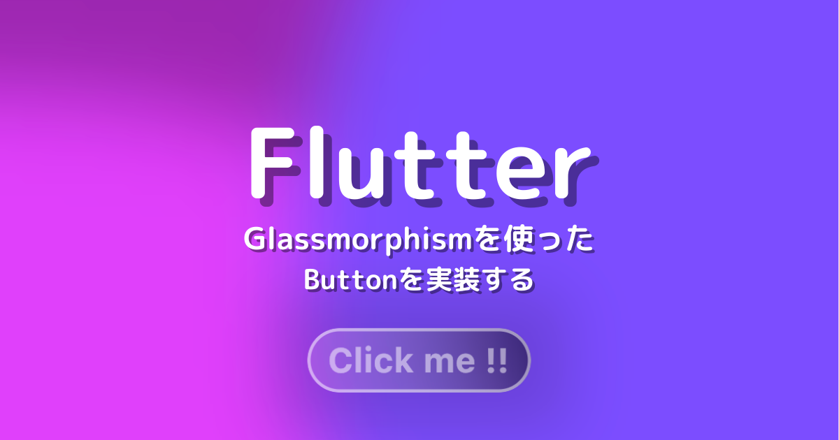
Flutterで、Glassmorphism(グラスモーフィズム)を使ったButtonの実装方法について解説していきます。
影の付け方や背景のぼかし方は以下の記事で解説していますので、そちらをご確認ください。
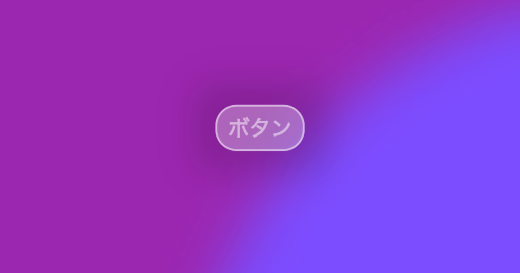
単色のGlassmorphism Button
GlassContainerをボタンにするために、InkWellを使用します。
押下時にRipple Effectを出したいため、InkWellはMaterialでラップしてBackdropFilterのchildにします。
→ 階層構造 … BackdropFIlter > Material > InkWell
BackdropFilter(
  filter: ImageFilter.blur(
    sigmaX: sigmaX,
    sigmaY: sigmaY,
  ),
  child: Material(
    type: MaterialType.button, // ボタンとして扱うため
    color: Colors.transparent,
    child: InkWell(
      borderRadius: BorderRadius.circular(radius), // リップルエフェクトがはみ出さないようにする
      onTap: onPressed,
      ・・・
    ),
  ),
)
ソースコード
import 'dart:ui';

import 'package:flutter/material.dart';

class ColoredGlassButton extends StatelessWidget {
  const ColoredGlassButton({
    Key? key,
    required this.label,
    this.labelPadding,
    this.onPressed,
    this.width,
    this.height,
    this.shadow = true,
    this.boxShadow,
    this.radius = 16,
    this.sigmaX = 16,
    this.sigmaY = 16,
    this.border,
    this.color,
  }) : super(key: key);

  final Widget label;
  final EdgeInsetsGeometry? labelPadding;
  final VoidCallback? onPressed;

  final double? width;
  final double? height;
  final bool shadow;
  final List<BoxShadow>? boxShadow;
  final double radius;
  final double sigmaX;
  final double sigmaY;
  final Border? border;
  final Color? color;

  @override
  Widget build(BuildContext context) {
    return DefaultTextStyle(
      style: TextStyle(
        color: Colors.white.withOpacity(0.3),
      ),
      child: Container(
        decoration: BoxDecoration(
          boxShadow: shadow
              ? boxShadow ??
                  [
                    BoxShadow(
                      blurRadius: 24,
                      spreadRadius: 16,
                      color: Colors.black.withOpacity(0.15),
                    ),
                  ]
              : null,
        ),
        child: ClipRRect(
          borderRadius: BorderRadius.circular(radius),
          child: BackdropFilter(
            filter: ImageFilter.blur(
              sigmaX: sigmaX,
              sigmaY: sigmaY,
            ),
            child: Material(
              type: MaterialType.button,
              color: Colors.transparent,
              child: InkWell(
                // リップルエフェクトがはみ出さないようにする
                borderRadius: BorderRadius.circular(radius),
                onTap: onPressed,
                child: Container(
                  width: width,
                  height: height,
                  decoration: BoxDecoration(
                    color: color ?? Colors.white.withOpacity(0.3),
                    borderRadius: BorderRadius.circular(radius),
                    border: border ??
                        Border.all(
                          width: 1,
                          color: Colors.white.withOpacity(0.3),
                        ),
                  ),
                  child: Padding(
                    padding: labelPadding ??
                        const EdgeInsets.symmetric(
                          vertical: 4,
                          horizontal: 8.0,
                        ),
                    child: label,
                  ),
                ),
              ),
            ),
          ),
        ),
      ),
    );
  }
}
使用例
ColoredGlassButton(
  label: Text(
    'ボタン',
    style: TextStyle(
      color: Colors.white.withOpacity(0.5),
      fontSize: 16,
      fontWeight: FontWeight.bold,
    ),
  ),
  border: Border.all(
    color: Colors.white.withOpacity(0.5),
    width: 1.5,
  ),
  onPressed: () {
    debugPrint('ColoredGlassButtonを押下しました。');
  },
),
グラデーションを取り入れたGlassmorphism Button
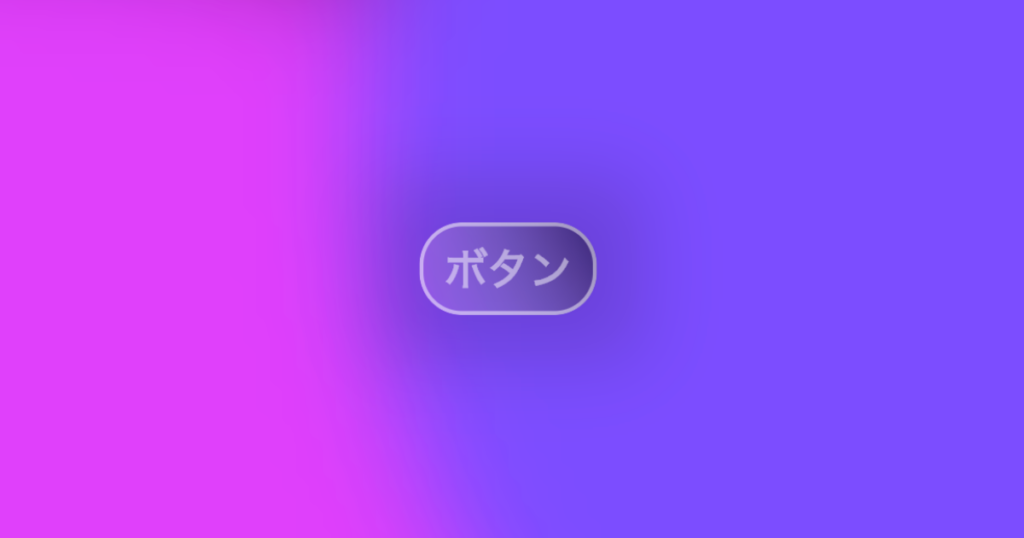
グラデーションをつけたい場合も、単色の時と同じように実装することができます。
ソースコード
import 'dart:ui';

import 'package:flutter/material.dart';

class GradientGlassButton extends StatelessWidget {
  const GradientGlassButton({
    Key? key,
    required this.label,
    this.labelPadding,
    this.onPressed,
    this.width,
    this.height,
    this.shadow = true,
    this.boxShadow,
    this.radius = 16,
    this.sigmaX = 16,
    this.sigmaY = 16,
    this.border,
    required this.beginColor,
    required this.endColor,
    this.beginAlignment = Alignment.bottomRight,
    this.endAlignment = Alignment.topLeft,
  }) : super(key: key);

  final Widget label;
  final EdgeInsetsGeometry? labelPadding;
  final VoidCallback? onPressed;

  final double? width;
  final double? height;
  final bool shadow;
  final List<BoxShadow>? boxShadow;
  final double radius;
  final double sigmaX;
  final double sigmaY;
  final Border? border;
  final Color beginColor;
  final Color endColor;
  final Alignment beginAlignment;
  final Alignment endAlignment;

  @override
  Widget build(BuildContext context) {
    return DefaultTextStyle(
      style: TextStyle(
        color: Colors.white.withOpacity(0.3),
      ),
      child: Container(
        decoration: BoxDecoration(
          boxShadow: shadow
              ? boxShadow ??
                  [
                    BoxShadow(
                      blurRadius: 24,
                      spreadRadius: 16,
                      color: Colors.black.withOpacity(0.15),
                    ),
                  ]
              : null,
        ),
        child: ClipRRect(
          borderRadius: BorderRadius.circular(radius),
          child: BackdropFilter(
            filter: ImageFilter.blur(
              sigmaX: sigmaX,
              sigmaY: sigmaY,
            ),
            child: Material(
              type: MaterialType.button,
              color: Colors.transparent,
              child: InkWell(
                // リップルエフェクトがはみ出さないようにする
                borderRadius: BorderRadius.circular(radius),
                onTap: onPressed,
                child: Container(
                  width: width,
                  height: height,
                  decoration: BoxDecoration(
                    gradient: LinearGradient(
                      colors: [
                        beginColor,
                        endColor,
                      ],
                      begin: beginAlignment,
                      end: endAlignment,
                    ),
                    borderRadius: BorderRadius.circular(radius),
                    border: border ??
                        Border.all(
                          width: 1,
                          color: Colors.white.withOpacity(0.3),
                        ),
                  ),
                  child: Padding(
                    padding: labelPadding ??
                        const EdgeInsets.symmetric(
                          vertical: 4,
                          horizontal: 8.0,
                        ),
                    child: label,
                  ),
                ),
              ),
            ),
          ),
        ),
      ),
    );
  }
}
使用例
GradientGlassButton(
  beginColor: Colors.white.withOpacity(0.1),
  endColor: Colors.black.withOpacity(0.5),
  beginAlignment: Alignment.bottomLeft,
  endAlignment: Alignment.topRight,
  label: Text(
    'ボタン',
    style: TextStyle(
      color: Colors.white.withOpacity(0.5),
      fontSize: 16,
      fontWeight: FontWeight.bold,
    ),
  ),
  border: Border.all(
    color: Colors.white.withOpacity(0.5),
    width: 1.5,
  ),
  onPressed: () {
    debugPrint('GradientGlassButtonを押下しました。');
  },
),